page.tsx
Properties
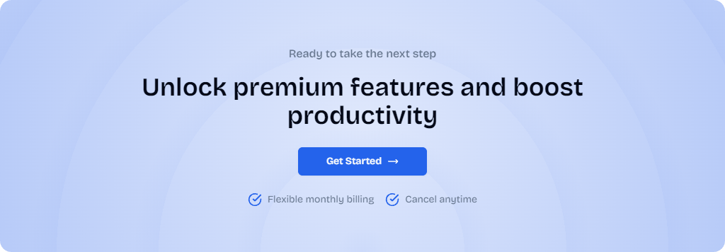
Title of the CTA
Description of the CTA
Text of the primary button
Redirect to the given path when the primary button is clicked
Whether to display a booking option alongside the main CTA
Custom CSS classes to apply to the component
Usage
example.tsx
Tips
When customizing the text in the CTA component, keep the following in mind:- Use action-oriented language in the main heading (e.g., “Unlock premium features”)
- Keep benefit statements short and impactful
- Use strong verbs that encourage immediate action for the button text that clearly communicates the next step (e.g. “Get Started”, “Try it Free”, “Learn More”)
If you need basic components like buttons, inputs, and more, they are
available with Shadcn UI.