
page.tsx
Properties
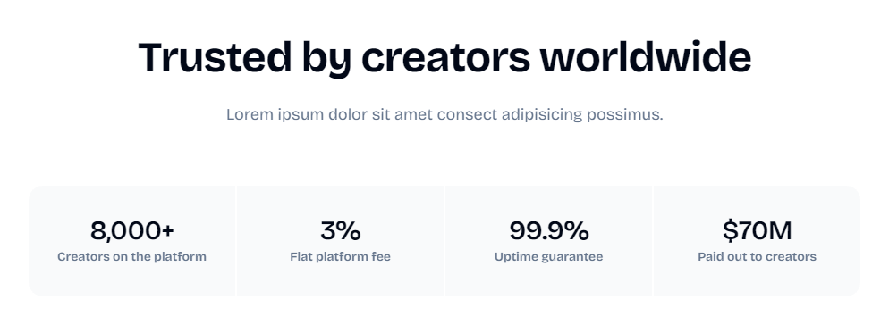
Title of the stats
Description of the stats
Usage
example.tsx
Tips
When customizing the Stats component:- Choose impactful metrics that demonstrate your platform’s success or scale
- Use concise labels for each statistic
- Format numbers for easy readability (e.g., “8,000+” instead of “8000”)
- Consider using percentages or currency values where appropriate
If you need basic components like buttons, inputs, and more, they are
available with Shadcn UI.