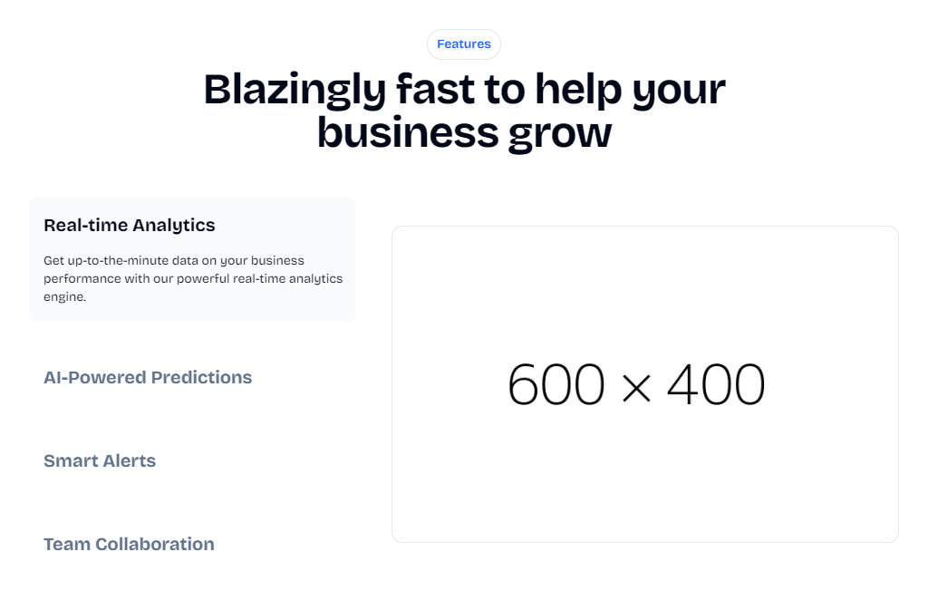

page.tsx
Properties
Determines the layout direction. If true, the accordion appears on the right
side on larger screens.
Title of the feature accordion
Description of the feature accordion
Usage
example.tsx
Tips
When creating content for the Feature Accordion component:- Keep feature titles concise and descriptive
- Write clear, benefit-focused descriptions for each feature
- Use high-quality images or videos that illustrate each feature in action
- Ensure the content is consistent in length across features for a balanced appearance
- Order features by importance or logical flow of user interaction with your product
If you need basic components like buttons, inputs, and more, they are
available with Shadcn UI.