Components
Support Button
The SupportButton component provides a customizable button that, when clicked, opens a support channel based on the configured support service or defaults to opening an email client.
page.tsx
Usage
example.tsx
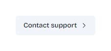
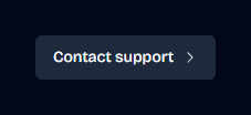
Remember to choose text that encourages users to seek help when needed, promoting a positive support experience. The current implementation uses “Contact support” with a right chevron icon, which is clear and straightforward.
The SupportButton component creates a button that, when clicked, provides support access through one of the following methods:
- Opens Crisp chat widget (if NEXT_PUBLIC_CRISP_WEBSITE_ID is defined)
- Opens Userdesk chat widget (if NEXT_PUBLIC_USERDESK_WEBSITE_ID is defined)
- Opens the default email client with a pre-filled support email (as a fallback)
Tips
When customizing the SupportButton component:
- Keep the button text concise and action-oriented (e.g., “Get Help”, “Contact Support”)
- Consider adding an icon to make the button more visually appealing
- Ensure the text aligns with your brand voice and support strategy
If you need basic components like buttons, inputs, and more, they are available with Shadcn UI.
Was this page helpful?