
page.tsx
Whether to show the booking button
Whether to show the testimonial
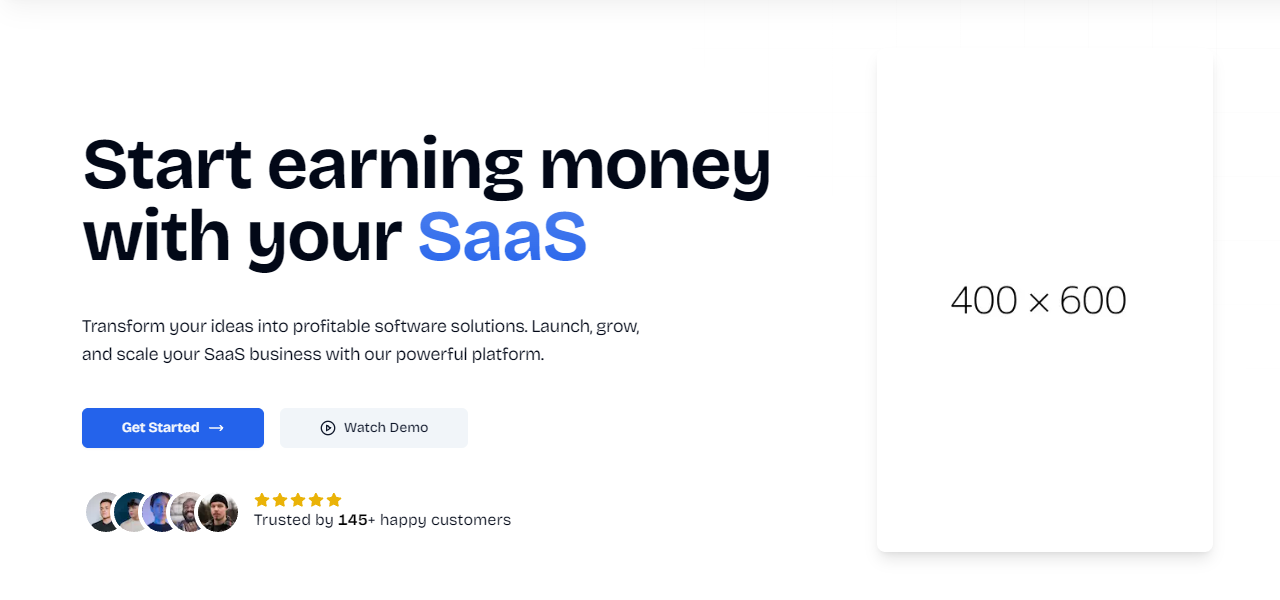
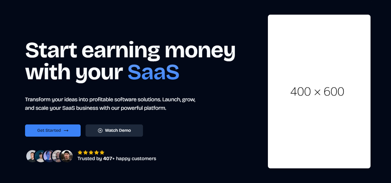
Orientation of the hero. Can be
center or left-centered.Whether to hide the image
Image to display in the hero
Usage
example.tsx
Tips
When customizing the Hero component:- Keep the headline concise and impactful, highlighting your main value proposition
- Use the subheadline to expand on the headline, addressing user pain points or benefits
- Ensure CTA button text is action-oriented and clear about the next step
- If using the testimonial, choose a compelling statistic or short quote that supports your value proposition
If you need basic components like buttons, inputs, and more, they are
available with Shadcn UI.