page.tsx
Properties
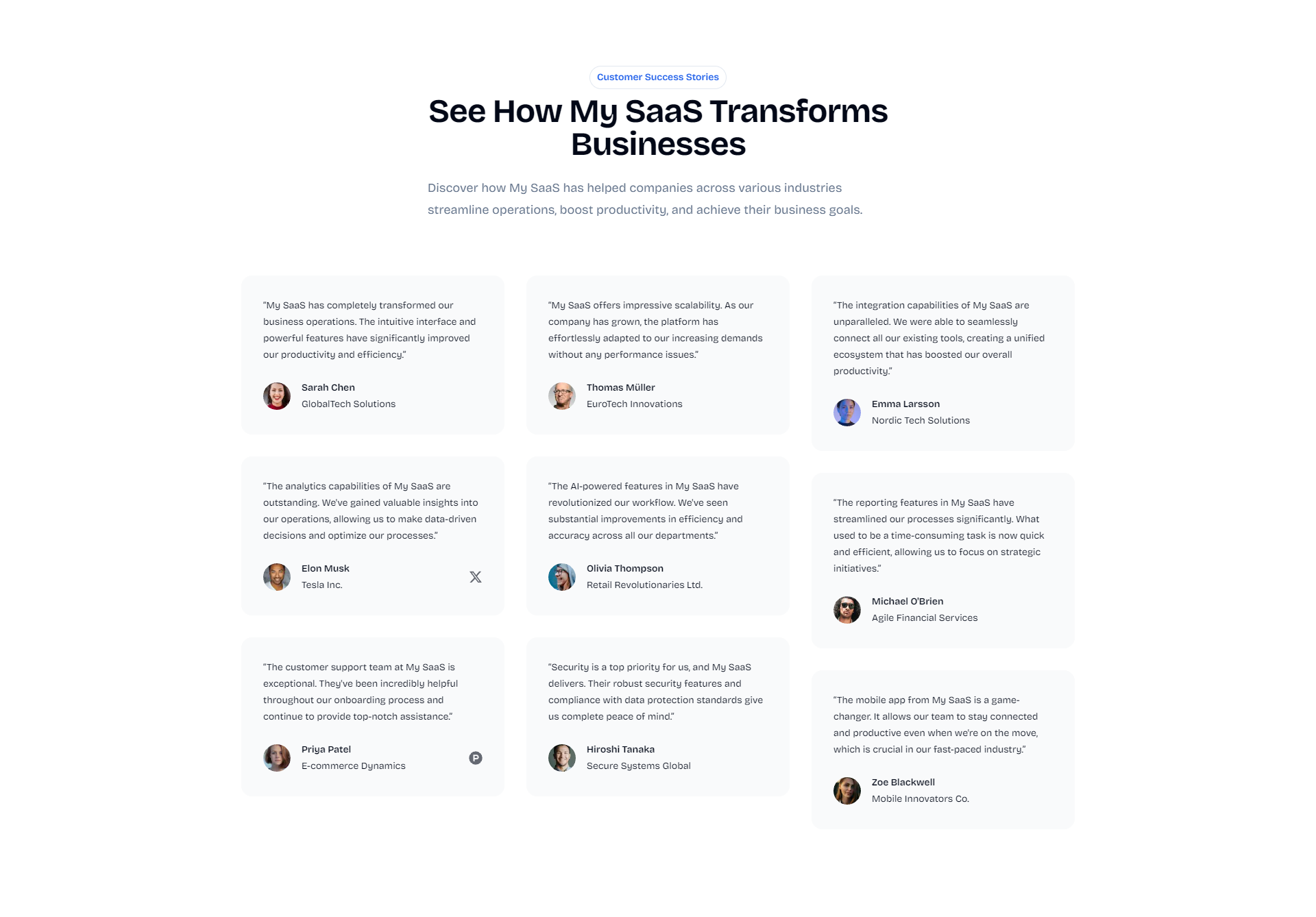
Title of the testimonial grid
Description of the testimonial grid
Usage
example.tsx
- Animated entrance effects for the title, description, and each testimonial
- Responsive grid layout that adapts to different screen sizes
- Support for customer quotes, names, companies, and profile pictures
- Optional social media links for customers
Tips
When customizing the Testimonial Grid component:- Use genuine, diverse testimonials that represent your target audience
- Keep quotes concise and focused on specific benefits or features
- Include full names, job titles, and company names for credibility
- Use high-quality, professional profile pictures
- Highlight testimonials from well-known companies or individuals in your industry
If you need basic components like buttons, inputs, and more, they are
available with Shadcn UI.